KRC Genk – Champions of Belgium

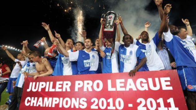
After 40 games of typically mad Belgian football, KRC Genk won the ‘winner take all’ tie against Standard Liege last night to claim their 3rd Pro League title in their history and their first since 2002.

The playoffs, as controversial as they are, did manage to throw up a perfect finale to a gruellingly long season. Standard Liege who finished 6th after the regular season of 30 games, hit perfect form at the business end of the season. They came into the game at Cristal Arena with 8 wins from 9 playoff games, whilst Genk had stuttered after a 3-0 beating against Club Brugge.

The unique situation regarding the playoffs meant that Genk and Standard went into the game on level points, but Genk were theoretically 0.5 points ahead. When the points were halved, any team on a odd number were rounded up to a full number, so Standard were given an extra half point. Yes, this is the only league in the world (probably) with this formula. This meant that Genk needed only a draw to lift the championship.

Standard Liege started the game the brighter, with their five man midfield holding the ball well. Former Wolves player Jelle Van Damme, who has been Standard Liege’s catalyst in the second half of the season, was allowed too much space and hit the bar with a cross.

Then the sickening turning point. Nifty winger, Mehdi Carcela was knocked out after a stray boot from Liverpool loanee, Chris Mavinga, and he hit the floor violently. Medical staff immediately rushed onto the field. It was rather similar to the John Terry incident at the League Cup final, in that Carcela’s face felt the full force of Mavinga’s boot. It left the Standard players stunned, notably Mémé Tchité who had to be consoled by a team-mate. Carcela was taken straight to hospital, and diagnosed with a broken nose and fractured jaw.

Genk took advantage and went close with two efforts, one of which was a terrible miss by Marvin Ogunjimi. Their star young-gun Kevin De Bruyne, supposedly the target of many clubs, never stopped trying and was the main creative threat for Genk.

But then the pendulum swung back to the away side right before the end of the half. A curling free-kick by Steven Defour, hit Mavinga on the leg and Eli Mangala got the final touch, sending the away end into raptures. The perfect time to score as well, 2 minutes into injury time.

The second half began as expected with a Genk onslaught. They controlled the game looking for that vital equaliser. Standard keeper Sinan Bolat was in fine form though; first stopping Ogunjimi then tipping a De Bruyne free kick around the post.

Vercauteren then rolled the dice with an attacking substitution, taking off masked captain David Hubert and replacing him with Nigerian Kennedy Nwanganga, who had been on the fringes after signing this year. He’s certainly written his name into Genk folklore now though, with a fantastic header 2 minutes after coming on. The Cristal Arena erupted and the tide turned once again.

The Standard fightback ensued, searching frantically for a goal. But Genk can thank their 19 year-old keeper Thibaut Courtois for producing three excellent saves, two of which from close range. He’s been sensational this year, playing every minute of a title-winning campaign. There have been rumours that Manchester United has scouted him, and I hope they were watching this performance – tremendous composure for a teenage goalkeeper.

Genk held out  and the Genk fans invaded the pitch before the trophy was lifted. Manager Franky Vercauteren ran onto the pitch fist clenched to celebrate with his players. He left Anderlecht in 2007 after poor results and a forgettable spell as national team coach, ‘The Little Prince’ has exorcised the demons of the past with this campaign. His policy of integrating youth players with a solid core at the back has paid dividends and many would agree that Genk deserve their title this season.

As for Standard Liege, they should be commended for a tremendous comeback in 2011, but it looks like the end of Dominque D’Onofrio’s tenure as manager. At times it seemed that Sérgio Conceição was the one doing the motivating from the bench. It would have been tremendously ironic that the team most opposed to the league format would lift the trophy at the end but it wasn’t to be. It will be interesting to see whether they can hold on to their two prized assets in Defour and Witsel during the summer. Likewise, scouts seem to swarming around the Cristal Arena too, with Genk’s stock rising. It was quite fitting that they wore shirts with ‘Mine for Talent’ on them.

Both clubs will be in the Champions League qualifying round, and if Genk keep their spine of their team, they could upset some European giants. That being said, they will be in the Champions side of the 3rd round so could face Rangers or Copenhagen for example. Standard Liege will be in the unseeded side and could face FC Twente, which would see Michel Preud’homme return to the club that he made his name at. Just merely draw speculation at the moment of course.

But what a season in Belgium – coincidently the first I’ve had the pleasure of watching. I’ve seen a player throw a duck off the field and recieve death threats. I’ve had trouble getting my head around 3 sets of playoffs. I’ve seen Charleroi sack umpteen number of managers and Wesley Sonck score an overhead kick in the snow. It’s been an experience, one which you can now follow on the Belgian Waffle – once I’ve sorted out a good logo. Watch this space.

Finally, congratulations to Genk fans. Deserved champions.

The Premier League Fashion Fix – Kits for 10/11 (Manchester City to Wolves)

Manchester City

Rather begrudgingly, I have to admit City have got their shirt spot on once again this year. They have changed their kit maker to Umbro, which seems to be a good move. Once again the phrase simplicity crops up Sky blue, white arm trim. Done. Very similar to England’s away kit with the fabric and look used.Also like the nice touch inside of the collar, of the classic City scarf. I think that was Mancini’s idea, he just loves striped scarves that fella.

Good work Umbro though, I’m liking your shirt philosophy. Man City are again sponsored by Etihad Airways will reveal their away kit on Friday (but it’s likely going to be red and black)

Verdict – 8/10

Manchester United

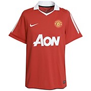
I’ve got mixed opinions on these two offerings by Manchester United. The home shirt is a big improvement on last year in my opinion, with Nike dismissing the black chevron for the traditional all red. Not that keen on the white sleeve stripes as it reminds me of the Umbro kit from 99/00. But other than that, it’s an above average effort boosted by the return of a collar. Eric would be proud

The away kit on the otherhand is hideous. I’ve always preferred a black away kit for United. White ones rarely work and the shoulder/sleeve design here is just weird, with the red stripes just tacked on there. Actually maybe United should be sponsored by Red Stripe. No that’s a bad idea.  Manchester United are now sponsored by Aon

Verdict – 6/10 (away kit drags it down)

Newcastle United

After last year’s shirt show-stealing performance for all the wrong reasons. Newcastle opt for a more conservative option this time round in their return to the top flight. The Championship winners of course have their black and white striped shirts, but it’s a pretty rubbish shirt. Puma have gone for some weird fabric that doesn’t look high quality, plus they’ve kept with the unorthodox collar (I like it but many don’t). The back is all white, which goes against the Geordie grain.

Also don’t really like the black shoulder design. There’s too much black there and it’s very reminiscent of the kit they wore to relegation. The away shirt is a peculiar shade of blue and to be honest I prefer the 3rd kit to it.

Newcastle are once again sponsored by Northern Rock.

Verdict – 4/10

Stoke City

Oh dear. Stoke’s new agreement with Adidas couldn’t have produced a more unsatisfying shirt. It looks like a patchwork quilt. Too many ideas are meshed together to create a monstrosity. Harsh?

The red and white stripes are accompanied by dashes in between. Why, I do not know. The neck/collar area looks strange and again Adidas have had to put a space for a Premier League badge. Speaking of badges, the Adidas one on the left is weirdly places. Yes, it is safe to say I hate this kit. The away kit arrives on the 2nd August, I’m hoping for something better.

Stoke continue their sponsorship with Britannia for this season.

Verdict – 2/10

Sunderland

Umbro make it a three peat of superb kits. As you can tell by the promo shot of Darren Bent with a ancient football, Umbro have gone for the classic look. The new sponsor, bingo website Tombola is put onto the shirt, without it looking out place. Interwoven if you will. The red and white stripes are complemented by a good red collar look.

The away kit as you can see is all white with a subtle hint of burgundy. I really like this kit as well. Fantastic effort.

Note- Tombola will not appear on junior shirts to comply with UK law

Verdict – 9/10

Tottenham Hotspur

Puma have gone a bit crazy with the Spurs shirt. Once again, don’t understand the decsion to move the Puma badge up to the shoulder on the home kit. The diagonal navy blue strip across the top of the shirt would be fine apart from the white stripes added along it. It just looks a bit off to me. The change strip is now sky blue. It’s been a while since it has and I think it’s a move for the better.

Overall not terrible but not great either. Spurs have a new sponsor in Autonomy

Verdict – 5/10

West Bromwich Albion

Well we finally have one Umbro kit I don’t like. The Baggies have bounced back to the Premier League for the umpteenth time and brought a polostyle home shirt with them. I don’t like polo shirt in general so I may be biased here, but the contrast between that and the sponsor Homeserve offsets the vintage look Umbro went for. Shame really.

The away kit however is a lot better. Subtle black stripes are simple and effective. Only downside for me as a traditionalist is West Brom not having green and yellow in their away kit.

Verdict – 6/10

West Ham United

It was unavoidable. This promotional picture had to be used. Mark Noble and Thomas Hitzlsperger eating a full English down a East Lahndan caff. Not fulfilling any Cockney stereotypes there then are we, West Ham PR department. The kit itself is unique in a way. The claret and blue hoops around the middle of the shirt seem to be in honour of Sampdoria possibly. Then again maybe not. Overall, not a bad away kit although slightly tarnished by Macron’s logo on the sleeve.

And of course away days are very much like this. Hash browns and bacon at a service station in your change strip.

West Ham have yet to reveal their home kit but they’ll still be sponsored by Sbobet

Verdict – 6/10 so far

Wigan Athletic

Wigan have finally unveiled their kit, in a friendly with Oldham last night. The cost-cutting decision to make their kit ‘in-house’ with company Mifit seems to have paid off. I really like this kit. The off-centre vertical stripe is different and I think it sets them apart. The sponsor slightly ruins a very good shirt as it looks out of place

The wait was worth it I guess. Wigan are sponsored by 188Bet again for 10/11.

Verdict – 7/10

Wolves

They are Premier League but not in the shirt stakes. Burrda have poorly imitated Umbro in the traditionalist approach but this could well be Mick McCarthy’s desire to hark back to the Molineux of old.  Muddy pitches and parasite football as Mick moaned all summer long.

Anyway, the shirt is not too bad until you realise that the retro idea is ruined by the Sportingbet sponsor. Alternatively buy the kids shirt since it won’t have. Although this might arouse suspicion.

The away kit is the reverse sans the silly collar.

Verdict – 5/10

There we have it. The Champions League places belong to Blackburn, Man City and Sunderland (Umbro). The fashion police have relegated Bolton, Stoke and Everton. Enough with this fashion facade. Back to normal running soon

The Premier League Fashion Fix – Kits for 10/11 (Arsenal to Liverpool)

With the World Cup well and truly buried (as well as Emile Heskey’s international career), it’s time to look forward to the new season. And obviously the first way to gauge how your team’s going to do is via the kit they’ve chosen to wear for 9 months. So allow me to become the footballing equivalent of Karl Lagerfeld and guide you through what your team is sporting for the coming season.

Arsenal

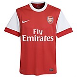
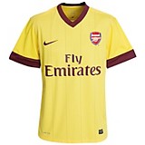
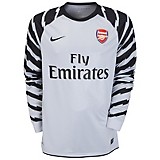
The home kit is very simple but works so well. Not convinced on the goalkeeper’s shirt, with the crazy lightning-like stripes on the sleeves. The away kit has returned to yellow, which is the colour Arsenal away kits should be. The ‘redcurrant’ pays homage to the Woolwich Arsenal days, like the home kit from 05/06 from the last Highbury season. Solid effort but I sort of get a Gryffindor vibe off the away kit. May as well tie in a film deal. Arsenal are of course still sponsored by Fly Emirates.

Verdict – 7/10

Aston Villa

Aston Villa’s claret and blue remains but there’s some changes from last year. Firstly, new sponsor in FxPro(Fulham share the same sponsor). Also  for some bizarre reason, Villa/Nike have chosen to have a chequered design down the side.  Don’t particularly understand why unless they fancy adding several Croatians to the side to make it valid. No blue outline around the collar this time.

The away kit is a bog standard black affair, again with the claret and blue chequered down the side. I assume it’s black to appease John Carew and Emile Heskey, not the slimmest of lads. Not a terrible kit by any means, I remember Villa’s away kit from 93 to 95

Verdict 6/10

Birmingham City


Their West Midlands rivals told the fans to vote for their favourite home kit at the end of the season. They went for the white chevron option, which I think is a good choice. F&C Investments continue their sponsorship of the Blues but the kit is now made by Chinese sportwear company Xtep, a decision mostly likely made by Hong Kong millionaire owner Carson Yeung. The away kit is plain and simple, which is what an away kit should be. Nothing fancy

Verdict – 7/10

Blackburn Rovers

Umbro once again continue their ‘Tailored by Umbro’ campaign and have produced a traditional set of kits for Blackburn. The vintage look works very well indeed, simplicity at its best. The away kit is all red for this season, with a black trim. Both are better than last year’s efforts, and if you’re a Blackburn fan crying out for new colours, I don’t understand you. Blackburn are still sponsored by Crown Paints

Verdict – 8/10

Blackpool

The Premier League turns tangerine and Blackpool have earned themselves some Wonga for the season. Ignoring the very bad pun, they are indeed sponsored by finance company Wonga.com. Pretty standard kit from Cabrini. All orange with a white collar. Simple and unfortunately the only season we’ll see this kit (yes I’ve joined the relegation parade before a ball is kicked)

Verdict – 6/10 (gains an extra point for the sponsor)

Bolton Wanderers

Finally, we have an abombination of a kit. I haven’t even edited this picture from the website. The kit looks like it’s in a heavenly place but it belongs in ‘Football Shirt Hell’. Or a bargain bin.

Bolton are again sponsored by 188BET (along with Wigan) and where do I start here? Firstly the red piping is just weird and all over the place. Next we have the sort of navy undone cravat shape around the collar. Don’t know why that’s there. Finally along the shoulders we have a massive Reebok logo. Just in case you didn’t know that Bolton are associated with Reebok.

Chavs will love it. I hate it, a horrible mish mash of ideas that could have been done so much better. An away kit has yet to be released, but I fear for the worst.

Verdict – 2/10

Chelsea

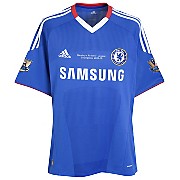
The champions kit has been out for a while now. In fact they wore it in the FA Cup Final. So this home kit has a perfect record. But it’s anything from perfect. The red collar is a bit strange, although I approve of the V-neck shape itself.  I also think the badge and sponsors are a bit too close together really. Otherwise the usual Adidas kit design is there.

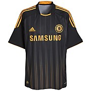
The away kit I like. Orange and black are a good combo (yeah because I’m a football fashionista. However it looks like a Wolves away kit to me, not a Chelsea one. I suppose that happens when you chuck out loads of colours each year. Not a big fan of the orange stripe bit towards the bottom (technical terms there). Still it’s better than looking like a steward.

Overall average. Chelsea are sponsored by Samsung.

Overall 6/10

Everton

Oh Everton. Why do you let yourself be sponsored by LeCoq Sportif. I’ve seen them make one good kit in their history (a French national kit I cannot find). But wow. Home kit doesn’t really need discussion here. It’s fairly standard and simple and I’m glad they’ve got rid of the Dairylea triangle bib from last year’s kit.

But my god is the away kit bad. Last year’s wasn’t good either, although I liked the concept of black and neon pink. The execution was lacking though, and this year’s designer deserves some sort of metaphorical execution. Pink kits work if you go for a pastel pink (like Palermo) but bright neon is a no no. Don’t even like the dark blue splodge across it either.

And guess what we’ll see this shirt at least 5 times. Hoorah for chavtastic kits. Everton are sponsored by Chang Beer once again.

Verdict – 3/10 (home kit would get a 7 by itself)

Fulham

Roy Hodgson has gone and so has big sponsor Nike. Kappa now produce the kit and it’s not a bad effort. Again simplicity works well, although the kit is slightly ruined by the decision to put the sponsor way up the shirt. Otherwise a good effort. Away shirt yet to be revealed, although I’d expect a red/black shirt.

Verdict – 5/10

Liverpool

Arguably the biggest talking point is saved til last. Liverpool without Carlsberg as a sponsor. I never thought I’d see the day but as Carlsberg say ‘If Carlsberg made a football team’, it wouldn’t be the state Liverpool is currently in.

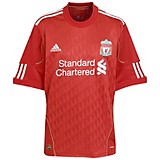
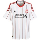
Standard Chartered take up the mantle as club sponsor. The home shirt is of course blood red, but with some strange decisions, mainly the gap in the Adidas stripes. I like the use of the triangle pattern, that works quite well. The away kit I dislike purely on the basis of the vastly spread apart pin-stripes. Why are they there?

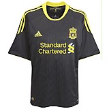
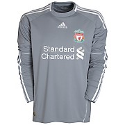
The third kit, again part of the Adidas neon piping range, would be good without one major flaw. The neon club badge. Ghastly. But weirdly enough, this is one of Liverpool’s best shirt designs in recent years because they usually get it very wrong. Like grey, who wears grey.

Damn it. You were so close Liverpool until you gave Pepe Reina a shade of grey to wear.

Verdict – 5/10

So there are the first 10 clubs. Join me soon to look at the Manchester club kits and hopefully no Newcastle away kit in sight. All kits are available in club shops and all good sportswear stores and sites. My preference – Kitbag.